Crom

Introduction
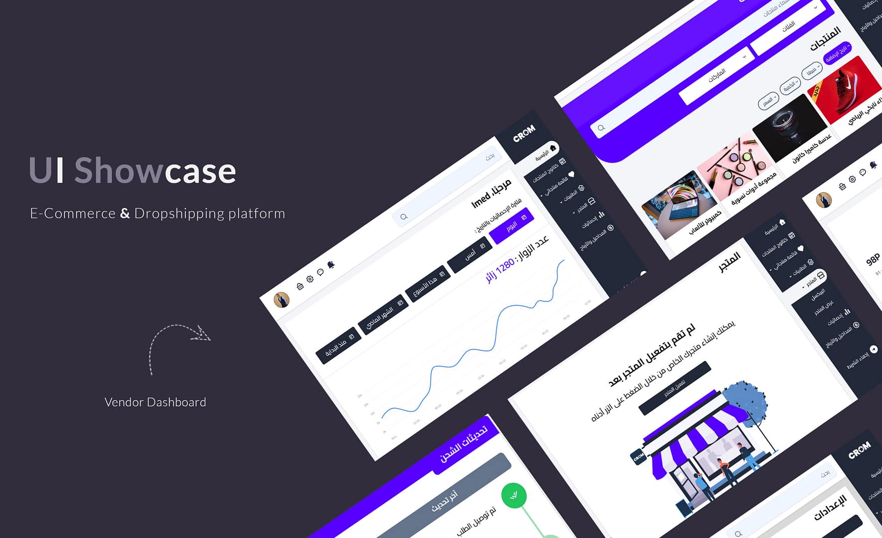
As a UI/UX designer, one of the most exciting projects that I recently worked on was redesigning back-office dashboards for a dropshipping services platform based in Algeria.
My goal is to create a design that enhances the user experience, improves functionality and optimizes the overall interface.
Understanding the User Needs
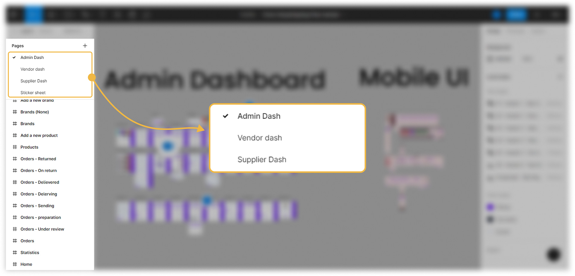
Before diving into the redesigning process, it is crucial to understand the needs and requirements of the platform’s users. For Crom‘s case, we can narrow down the target audience to three types of users:
The Vendors: These are the users who list and sell their products on Crom. They need an interface that allows them to manage their inventory, orders, and transactions effectively.
The Suppliers: These are the users who specialize in dropshipping and work directly with retailers or sellers. They handle the warehousing, inventory, and shipping of the products.
The Admins: These are the users who manage the platform. They need an interface that allows them to monitor the platform’s performance, manage user accounts, and resolve disputes.
With these user needs in mind, I can begin the redesigning process.
Simplifying the Navigation
One of the critical aspects of a dashboard’s design is the navigation. I want to make sure that users can quickly find what they’re looking for without any confusion. In the current Crom dashboard, the navigation is cluttered with too many options and categories, making it challenging for users to navigate.
My proposed redesign will simplify the navigation by grouping related options and minimizing the number of categories. I will also use clear and concise labels that are easy to understand. This approach will make the dashboard more user-friendly and improve the overall user experience.
Streamlining the Workflow
Dropshipping is a complex process that involves multiple steps, from listing products to managing orders and transactions. The current Crom dashboard does not provide a seamless workflow, making it challenging for users to manage their tasks efficiently.
My redesign will streamline the workflow by providing a clear and intuitive interface that guides users through the dropshipping process. I will also provide users with quick access to the most commonly used features, such as managing inventory and orders. This approach will save users time and increase their productivity.
Visual Hierarchy and Consistency
A good dashboard design needs to have a clear visual hierarchy and consistency in its elements. The current Crom dashboard has a cluttered interface with inconsistent elements, making it challenging to navigate and understand.
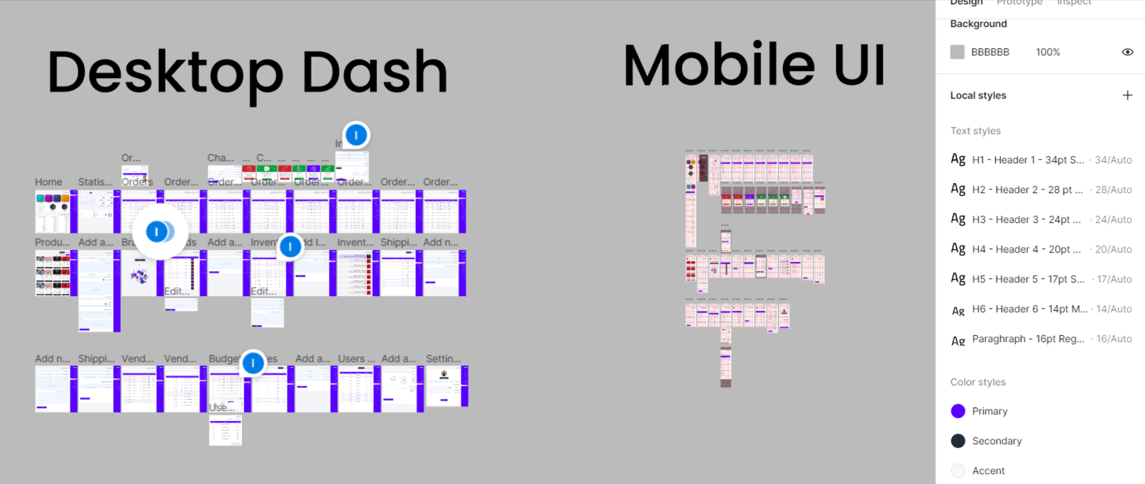
My redesign will focus on creating a clear visual hierarchy, with a consistent layout and typography. I will also use colors and icons to help users quickly identify and differentiate between different elements. This approach will make the dashboard more visually appealing
I also made sure that the new design was mobile-friendly, as many of Crom‘s users access the platform from their mobile devices. The mobile version of the dashboard provided users with the same features and functionality as the desktop version.
Challenges and Solutions
One of the challenges I faced during the redesign process was the platform’s complexity. Crom offers various services, and it was challenging to present all the information in a concise and understandable manner. To solve this, I used a modular design approach and created separate modules for different functions. This approach helped users focus on the task at hand and reduced cognitive load.
Another challenge I faced was the need to provide real-time information. Crom‘s users rely on the platform to track orders, manage inventory, and monitor shipments. I solved this by integrating real-time tracking and notifications, ensuring users had up-to-date information on their orders and shipments.
Conclusion
Redesigning Crom‘s dashboard was a challenging but rewarding task. The new design provides Crom‘s users with an intuitive and user-friendly experience that caters to their needs. By focusing on simplicity, clarity, and ease of use, I was able to create a modern and up-to-date design that provides users with the necessary information and functionality.
Tabby


